Subscribe

Powered By

Powered by Blogger

Jumat, 25 Februari 2011

Contemporary Interior Design Ideas - Squaring


One thing that stands out about contemporary and modern design is its sharpness, its concern with function and function as the design itself. Square angles are incredibly functional – it its basic form it maximises space, it is most conducive to guests facing each other while they sit, it gives the easiest option for placement of tables and other accents.

The look of the square design in a lounge is about creating a subtle paradox – the angles and placement are square and sharp, but some of the pieces are curved and sleek and all serving an exact purpose and function. It is related to the use of and shape of the people who are in the room and this creates a really cool relationship between the people, the design and the pieces.

By having this style and it's objects placed in a square fashion, not only does it increase space – which of course makes everything seem bigger and more open, it gives the visitor more time to reflect on what is in the room and its relation to the space.

These shapes also cause us to be extra aware of the space around the object. A square shelving unit on the wall for example, holding books or decorations inside, but carrying nothing on top is a bit of fun tricking on the mind's eye. It is about function and here is a spot where the function is ignored – it can be used, but is not. This causes us to reflect on the space around it and thus on the piece itself.

Take some of the latest interior design ideas and use them in your home – you'll be amazed how different your rooms will look!

Image: decorology

Senin, 21 Februari 2011

Using Colour – Going Green


We're probably all getting fed up with the cliché 'going green' and yet this timeless classic colour has survived through the decades in various shades and continues to be many people's choice of colour in any room in their home.

Darker shades of green, Regency or racing green for example, are ideal for large living areas. Going dark on an accent wall and bringing the room together with dark green ready made curtains, cushions and throws can creates a refined and sophisticated look. Paler shades are ideal to team with soft pinks for an on-trend look which suits all styles of homes; while acid or lime greens are the perfect colours to use with white, aubergine or hot pink in contemporary living spaces.

You don't have to go over-board, as too much of one colour can be very overpowering, however, buy adding pops of green, such as lime green curtains or a green rug, you can rejuvenate a tired looking room instantly without having to carry out a complete makeover.

Green symbolises growth and new life, making it's the ideal colour to use to give your home a fresh new look this spring. Add floral designs in soft furnishings to create a country cottage look, a majestic and sophisticated look can be achieved using darker hues and for those who want to inject the latest trends should opt for lime, neon or acid greens!

Image: Belle Maison

Jumat, 18 Februari 2011

West Coast Homes & Design

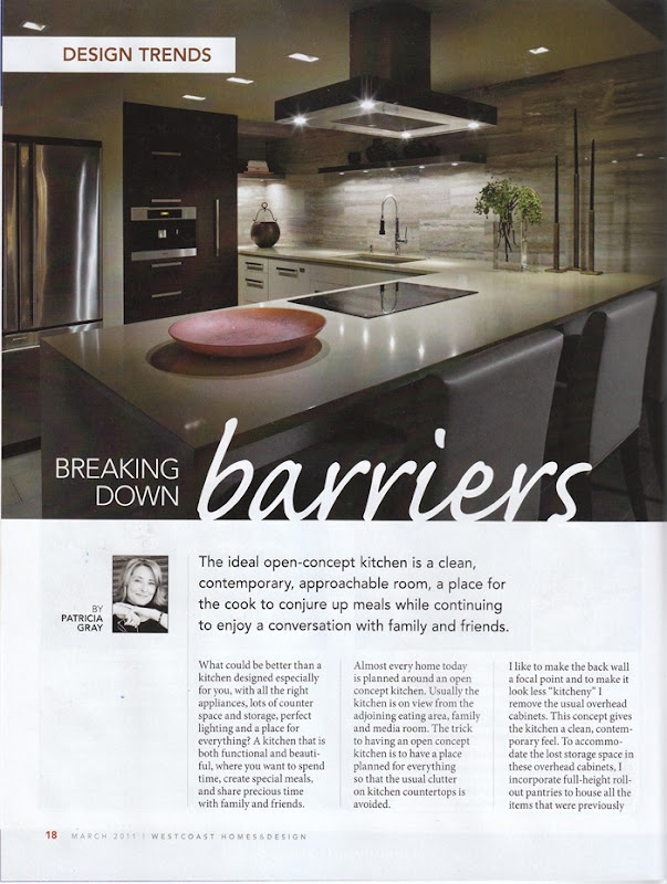
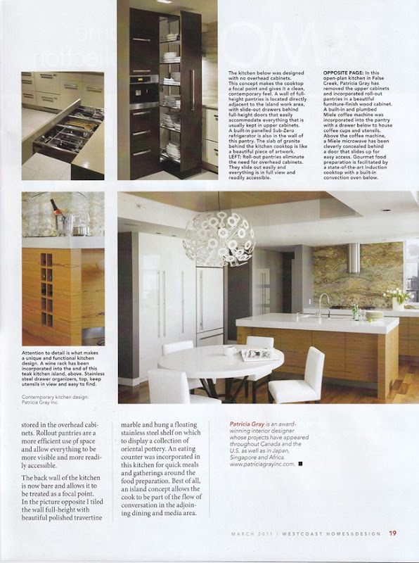
This is an article that was just published in West Coast Homes & Design.

WestCoast Homes and Design

WestCoast Homes and Design Patricia Gray
PDF

PATRICIA GRAY INC is an award winning international interior design firm writing about lifestyle and WHAT'S HOT
in the world of interior design, architecture, art and travel.
2011 © Patricia Gray | Interior Design Blog™

Top School Interior Design - Online School Interior Designs

Top School Interior Design - Online School Interior Designs depends on right choice of school to attend. Your clientele will definitely depend on the contacts you know, and the relationships you build in school with other prospective interior designers are fundamental to building a great career. However, the first thing to hurdle is your choice of school. 1. FocusIs it solely Top School Interior

Using Colour - Natural Palettes of Shades Part 2


Carrying on from our my last post - once a base colour has been selected and applied to the majority of the wall surfaces, accent colours can be use to highlight feature aspects of the room; nature-based shades of brown, blue and grey work really well but equally splashes of bright, contrasting colours can be used to add interest and excitement; maybe some fuchsia pink cushions and matching throw or a stunning display of bright red silk flowers in a tall vase. You may like to swap and change these from season to season to give your room a quick and easy update.

Texture is very important when using natural shades; it helps to add layers and depth to what might otherwise be a rather “flat” scheme. In keeping with the simple and uncluttered theme of the Natural décor, a few well-chosen and stunning pieces work better than lots of random items strewn around the room. Again, borrowing from nature offers an enormous choice of beautiful items for your room; sea shells, rocks, smooth pebbles, drift-wood, leather, metals, both shiny and matt and natural fabrics like Hessian and calico.

Flooring in Natural palette rooms is well suited to wood (scrubbed floor-boards rather than shiny formal parquet), stone or rustic tiles. This can be softened by putting down rugs to create a warmer feel to the room.

Image: Belle Maison

Rabu, 16 Februari 2011

Dreaming of Summer

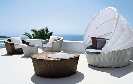
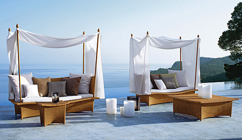
Summer is just around the corner – or is this wishful thinking on my part? At this time of year my thoughts turn to thinking of summer and imagining the warmth and taking time to relax outside. So my attention was rightfully piqued when I saw these beautiful pieces of furniture. I always look for a theme when I am captivated by images, and these pieces have canopies over them, thereby eliminating the need for an umbrella. I like the fact in design that ‘form follows function’ and especially when function can be made inherently beautiful.  In other words these loungers are self-contained and functionally-integrated escapes from the sun.

 Hemisphere Lounge Chairs,Cocktail and Side Tables, Orbit with Canopy - Richard Frinier for Dedon
 Hemisphere Lounge Chairs,Cocktail and Side Tables, Orbit with Canopy - Richard Frinier for Dedon

 Daydream Daybeds, Cocktail and Side Tables - Richard Frinier for Dedon 
Daydream Daybeds, Cocktail and Side Tables - Richard Frinier for Dedon

I can just imagine sitting in the warmth in these beautifully designed and functionally-integrated pieces of furniture.
What about you? Are you dreaming about summer?

PATRICIA GRAY INC is an award winning interior design firm writing about lifestyle and
WHAT'S HOT in the world of interior design, architecture, lifestyle, and travel.
2011 © Patricia Gray | Interior Design Blog™

Senin, 14 Februari 2011

Using Colour - Natural Palettes of Shades Part 1


The possibilities for choosing a colour scheme for your room can seem endless and somewhat daunting. However, by considering various criteria you will almost certainly decide upon a scheme that you love and is just right for your room. Personal choice and favourites are a good place to start – which colours are you naturally drawn to and make you feel good? Think about the size of the room you are decorating and what the room will be used for. How much natural light is there and how much will you be relying on artificial lighting?

The colour wheel is a useful tool when deciding on a colour scheme as it guides you through the harmonising and complementary colours and can help you to decide which combinations of colours and shades work for you and your room.

The Naturals palette of shades is ever popular and timeless. It offers simplicity and a clean and calm ambience. Although maybe not considered as colours in themselves the enormous choice and variety of white and cream shades can be used cleverly to create interesting and beautiful interiors. This is particularly so when they are combined with the creative use of textures and in accessories such as rugs, ornaments, cushions and throws.

Image: Belle Maison

Kamis, 10 Februari 2011

Using Colour – Hide & Highlight!


The clever use of colour can help to create lots of different effects in your room. Colour can be used to highlight feature points of the room or to help conceal area that you want to down-play. Cool colours give the effect of increasing space and make the walls appear to recede while warm colours create a cosy environment and tend to bring walls “closer together”. A light colour will help to make a low ceiling appear higher, whereas painting a darker colour on the ceiling will give the impression of bringing it down and reducing the cold feel of the room.

Yellow is an ever-popular colour choice for lots of rooms in the house and can be used in different ways to create a variety of looks. Yellow is naturally cheerful and welcoming, so is a great choice for halls and stairs. However, it can also work to brilliant effect in kitchens and bedrooms.
Pastel yellow shades are a good choice if you are looking to create a sense of airiness and calm.

However, care is needed when using clear yellow shades in north-facing rooms as the poor natural light can lead to a rather drab effect. Denser, more opaque shades tend to work better here. Try accessorising with cushions and throws in a strong, toning colour such as blue or green to create interest and focus in your room. Coloured-glassware and lush green-foliaged house plants will sit well in this setting and complement your colour-scheme.

Image: Belle Maison

Rabu, 09 Februari 2011

Advice for New Moms: Pewter + Sage

I'm pleased to welcome Sarah of the blog Pewter + Sage as this week's guest blogger in the Advice for New Moms guest post series. Sarah is a new mom herself, having just had her sweet baby girl Maura just three short months ago. In addition to her new role as mommy, Sarah is also the owner of her own business, where she makes beautiful custom stationery for weddings and just about anything else

Senin, 07 Februari 2011

Using Colour – Pops of Pink


If you are a true lover of pink then you might wish to experiment with varying tones from a hot pink used for wall paint to lighter blushing pinks in textiles and accessories. Do use colour samples to help you get the right tonal scheme. You might want to try something a little whimsical and unexpected with a pink toilet lid or a pink basin in the bathroom.

A rich fuchsia pink is very glamorous when used with metallics and/or mirrored furnishings - an update on Hollywood glamour you might say. When using darker pinks it is very important to get the lighting right in the room - for a focal wall in fuchsia pink, use flexible wall lights or spotlights.

For a touch of luxury, why not cover an antique chair with stunning pink velvet fabric and team with full length hot pink curtains which pool sensually onto the floor in the bedroom? The mix of old and new is bang on-trend this year and despite the misconceptions of pink being too feminine team it with soft grey or the palest of lilacs and you'll have a winning colour combination!

Image: Belle Maison

Jumat, 04 Februari 2011

Week Five: A Tour Inside

Last Saturday Dave and I took Dave's grandmother and her best friend on a tour of our new house. Both widows in their 80s, these ladies drive around the South and Southwest volunteering their time and energy to various Christian charities and churches and I am constantly amazed by their energy and faith and we had a great time visiting with them. In any case, as promised, I took a few pictures

Kamis, 03 Februari 2011

On my love of blue.

Atlanta Showhouse It's no secret that I've been having an ongoing love affair with blue the past year or so -- in fact, my family room is practically a homage to the color. Perhaps it's attributable to living in Houston, where the heat and strong light make cool blues particularly refreshing and attractive: no need to worry about a room feeling too cold, after all! Or perhaps it's that I love the

Using colour – It's Yellow in 2011!


If you want to incorporate this year's interior design colour yellow into your home there are some great shades available for both contemporary and traditional interiors.

Contemporary:
Vivid yellow - think of lemons and a bright summer sun - can be used in a contemporary setting to create a modern and edgy vibe in your room. Vivid colours give high impact and need good natural light to be seen to best effect. Preparation is all important when using such a solid flat colour as any imperfections will be all too easily highlighted. Accessories need to be in keeping with the bold theme of the room and give that wow-factor; the more unusual and eye-catching the better! Look for a range of fabulous plain and patterned curtain fabrics online to make your window dressing and soft furnishings.

Traditional:
Deep yellow is a good choice if you want to create a timeless and traditional interior; it also has the advantage of working well in rooms where natural light is limited and carefully placed lamps and lighting are utilised. Deeper shades of yellow lend themselves to a more relaxed unstructured look so an eclectic mix of simple, uncoordinated accessories such as faded rugs and old leather-bound books will transform you room into a warm and inviting space.

Image: Atticmag

Rabu, 02 Februari 2011

Small modular home office furniture - Modern office furniture online

One of the other great Small modular home office furniture - Modern office furniture online is that it can adjust and grow as your business changes and grows. Once you have choose a modular office system, it is easy to add onto or change configurations as needed. It offers room to grow your business without having to restructure your entire office environment.Ergonomics is an important

Selasa, 01 Februari 2011

Red, White and Turquoise

Outfitting a room in complimentary colors (which are two hues that are opposite each other on the color wheel), like red and green, has long been a designer's trick to achieving pleasing visual contrast in a space; however, these complimentary pairings (blue/orange, yellow/purple, red/green) can often read as very traditional. To get a more modern feel, try adjusting one or other of the hues